#| label: import-data-r

library(readxl)
# The argument skip allows you to forget the nice merged first row as title to obtain only structured-data.
wbs_raw <-readxl::read_excel("list_tasks.xlsx",
                             sheet=1,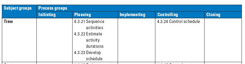
skip =1)This quick fix is a small data science projects that builds a Gantt Chart using scripts in R 1 and Python 2. A Gantt Chart is a bar plot that displays project activities as bars against time (Meredith, Shafer, and Mantel 2017) used to manage the schedule not only during the planning process group 3, but also during controlling (Silvius et al. 2013). The scope base line contains the project deliverables that are considered when building the schedule model (Project Management Institute 2017). The main strength of this technique is the ability to clearly display the status of each activity at a glance (European Commission: Directorate-General for Digital Services 2023).
But is this relevant in the industry too?
The following quote is a main task in project controlling and reporting for a job advertisment from Siemens as Project Manager.
Continuously monitor project status, taking the IFRS into consideration, identify any non-conformities in good time and initiate specific counter measures where applicable
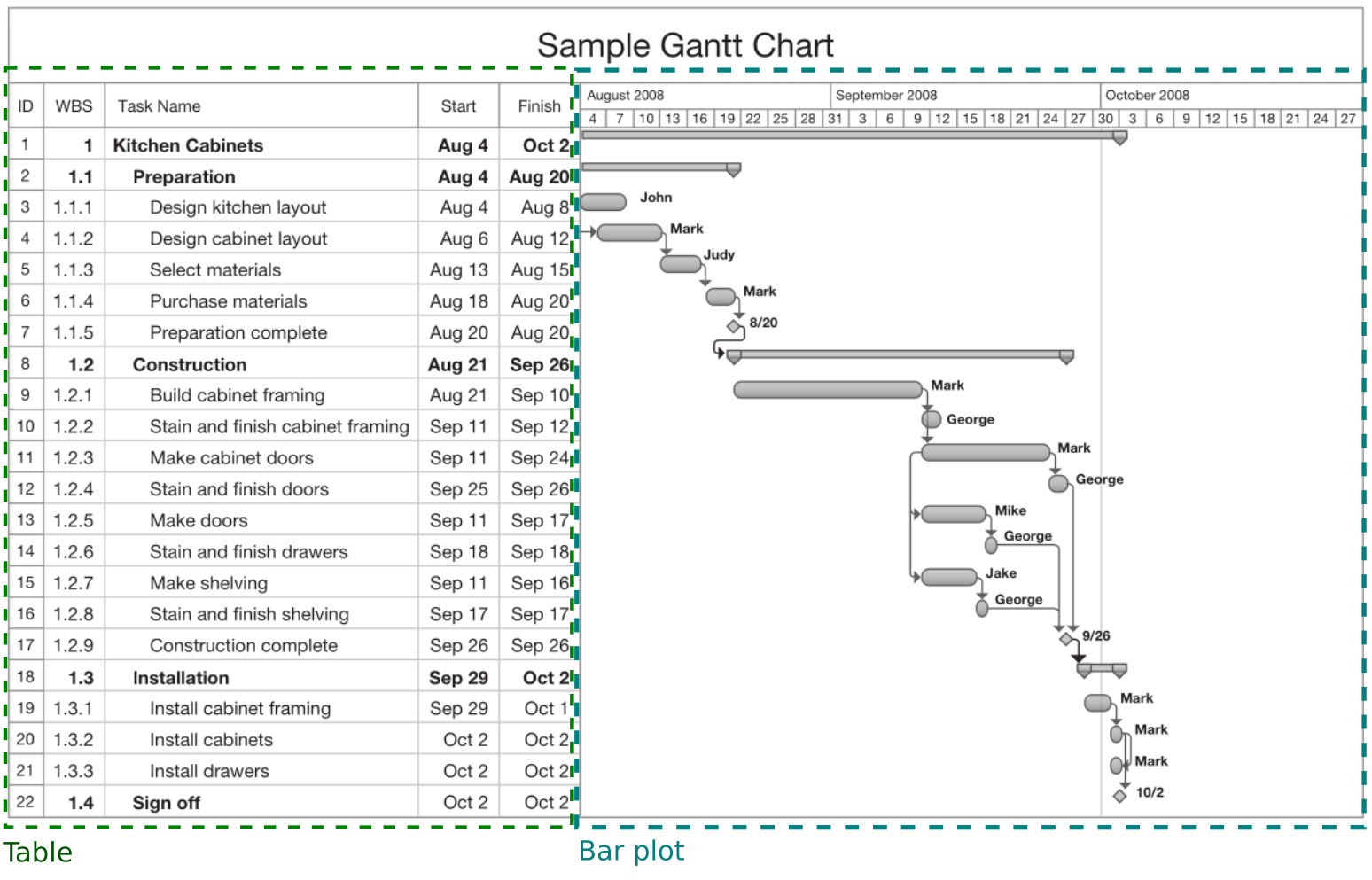
The next figure is an example taken from Snyder (2017) of a Gantt Chart
 The goal of this quick fix is to automatize the creation of a similar bar plot from a spradsheet file in R and Python.
1 Import
In this scenario a colleague has sent you a spreadsheet generated by proprietary software (Excel), although you insisted on exporting the file as .csv to follow the 5-start deployment of Open Data as taught in GIMA to improve interoperability. It could be worse, it could have been a pdf file or word document. In the spreadsheet I added a nice merged first row as title to make things more interesting.
#| label: import-data-py

import pandas as pd
wbs_raw = pd.read_excel('list_tasks.xlsx',
                        sheet_name ='Hoja1',
                        skiprows=1)
2 Tidy
Why do we need to tidy the data? I thrive on chaos. Unfortunately, computer says no. Functions requires a specific type of data, missing values can be problematic and spaces and especial characters (i.e. accents, fancy letters such as ñ…) tend to make things too interesting (and complicated). Let’s have a look
#| label: structure-r
library(tidyverse)
glimpse(wbs_raw)wbs_raw.info()Firstly the missing values (aka Non Available - NA) are coherent, since your colleague does not know yet when the project was over, only the planned or estimated date. Secondly, the computer also says no when it sees spaces between the columns (aka fields or variable if well formated), so let’s apply snake case to them. Lastly, computer said dates (Fecha Inicio and Fecha Fin) are characters (text) and we say they are dates (time).
#| label: tidy-data-r

# First, rename those column's name. Why doing this first? Because the new names will be easier to select.
wbs_renamed <-  wbs_raw |>
  rename(fecha_inicio=`Fecha Inicio`,
         fecha_fin = `Fecha Fin`,
         duracion_estimada = `Duración Estimada`,
         asignado_a = `Asignado a`,
         titulo = Título)

# Second, Select the columns with data excluding those with missing values (NA)
wbs_cleaned <- wbs_renamed |>
  select(c(titulo,fecha_inicio, fecha_fin, duracion_estimada,asignado_a))

# Last, let's impose our will to the computer saying that the dates are dates, not a simple text
wbs_tidy <- wbs_cleaned |>
  mutate(fecha_inicio = as.Date(fecha_inicio, format=c("%d/%m/%Y")),
         fecha_fin = as.Date(fecha_fin, format=c("%d/%m/%Y")))
wbs_tidy_long <- wbs_tidy |>
  pivot_longer(cols=c(fecha_inicio, fecha_fin),
               names_to="date_type",
               values_to="date")
# First, rename those column's name. Why doing this first? Because the new names will be easier to select.
wbs_raw.rename(columns={"Fecha Inicio":"fecha_inicio",
"Fecha Fin": "fecha_fin",
"Duración Estimada" : "duracion_estimada",
"Asignado a":"asignado_a",
"Título":"titulo"}, inplace=True)
# Second, Select the columns with data excluding those with missing values (NA)
wbs_cleaned= wbs_raw[['titulo','fecha_inicio', 'fecha_fin', 'duracion_estimada','asignado_a']].copy()
# Last, let's impose our will to the computer saying that the dates are dates, not a simple text
wbs_cleaned['fecha_fin']=pd.to_datetime(wbs_cleaned['fecha_fin'], format="%d/%m/%Y")
wbs_cleaned['fecha_inicio']=pd.to_datetime(wbs_cleaned['fecha_inicio'], format="%d/%m/%Y")
# Create extra columns
import datetime as dt
wbs_cleaned['days_to_start']= (wbs_cleaned['fecha_inicio'] - wbs_cleaned['fecha_inicio'].min()).dt.days
wbs_cleaned['days_to_end'] = (wbs_cleaned['fecha_fin'] - wbs_cleaned['fecha_inicio'].min()).dt.days
wbs_cleaned['task_duration'] = wbs_cleaned['days_to_end'] - wbs_cleaned['days_to_start'] + 13 Transform
Colors [⁴]
#| label: fig-gantt
library(ggplot2)
ggplot() +
  geom_line(data=wbs_tidy_long, mapping=aes(x=fct_rev(fct_inorder(titulo)), y=date, color=asignado_a), linewidth=10) +
  ### titles
  labs(
    x = "WBS",
    y="August 2025",
    colour = "Responsible",
  ) +
theme_linedraw() +
   ## Event 1
  geom_hline(yintercept = as.Date("2025-08-17"), colour ="red", linetype="longdash") +
  geom_label(aes(x="work package 3", y =as.Date("2025-08-17"),
                 label="Milestone"), hjust= -0.05, vjust= -2.0,color="red", fill="white", inherit.aes = FALSE ) +
theme(plot.title = element_text(hjust=.5, face="bold",size= 22),
      axis.text.y = element_text(size=12),
      axis.text.x = element_text(angle=45, vjust=-0.001),
      plot.subtitle = element_text(hjust=.5, size=18, colour = "gray45"),
      legend.position = "bottom",
      plot.margin=unit(c(1,1,3,1), "lines")) +
scale_y_date(date_breaks = "1 day", date_labels ="%d") +
coord_flip()
import matplotlib.pyplot as plt
import matplotlib.patches as mpatches
import matplotlib

team_colors = {'person A': 'c', 'person B': 'm', 'person C': 'y', 'person D': 'b'}
patches = []
for asignado_a in team_colors:
    patches.append(matplotlib.patches.Patch(color=team_colors[asignado_a]))

fig, ax = plt.subplots()
for index, row in wbs_cleaned.iterrows():
  plt.barh(y=row['titulo'],
         width=row['task_duration'],
         left=row['days_to_start'],
         color=team_colors[row['asignado_a']])
plt.title('Schedule for project', fontsize=15)
plt.gca().invert_yaxis()
# Base date: earliest fecha_inicio
base = wbs_cleaned['fecha_inicio'].min()
# Generate daily dates from min(fecha_inicio) to max(fecha_fin)
dates = pd.date_range(start=base, end=wbs_cleaned['fecha_fin'].max(), freq='D')
# Tick positions
xticks = (dates - base).days
# Labels
xticklabels = dates.strftime("%d")
plt.xlabel("August 2025")
plt.xticks(xticks, xticklabels)
ax.axvline(x=4, color='r', linestyle='dashed')
ax.text(x=4.5, y=0.55, s='Milestone', color='r')
ax.legend(handles=patches, labels=team_colors.keys(), fontsize=11)
plt.show()
4 Visualize
5 Communicate
6 Conclussion
7 Acknowledgment
- How to fix Object.renameSync # References
References
European Commission: Directorate-General for Digital Services. 2023. PM² Project Management Methodology – Guide 3.1. Publications Office of the European Union. https://doi.org/10.2799/970188.
Meredith, Jack R, Scott M Shafer, and Samuel J Mantel. 2017. Project Management in Practice.
Project Management Institute. 2017. A Guide to the Project Management Body of Knowledge (PMBOK Guide). 6th ed. Newton Square, PA: Project Management Institute.
Silvius, Gilbert, Rochelle Rober, Rommert Stellingwerf, Anton Zandhuis, and Andre Legerman. 2013. ISO 21500 in Practice. Edited by Van Haren Publishing. Zaltbommel, Netherlands: van Haren Publishing.
Snyder, Cynthia. 2017. A Project Manager’s Book of Forms. 3rd ed. Nashville, TN: John Wiley & Sons.
Footnotes
Footnotes
Tutorial in R to build Gantt Charts by Zach Bogart and Joyce Robbins from EDAV19, Colorado University↩︎
Tutorial in Python to build Gantt Charts by Elena Kosourova from Datacamp↩︎
From a manager view on a project, the five group processes are:
1. Initiation,2. Planning,3. Implementation,4. Controlling and 5. Closing of planning↩︎